

Hanlin Rebranding
MARK WINNER
-
CategoryCommunication Design
-
SubCategoryCorporate and brand identity
-
Applicant CompanyBank of Culture / Taiwan
-
Manufacturer / Business OwnerHan Lin Publishing Co., Ltd. / Taiwan
-
Design CompanyBank of Culture / Taiwan
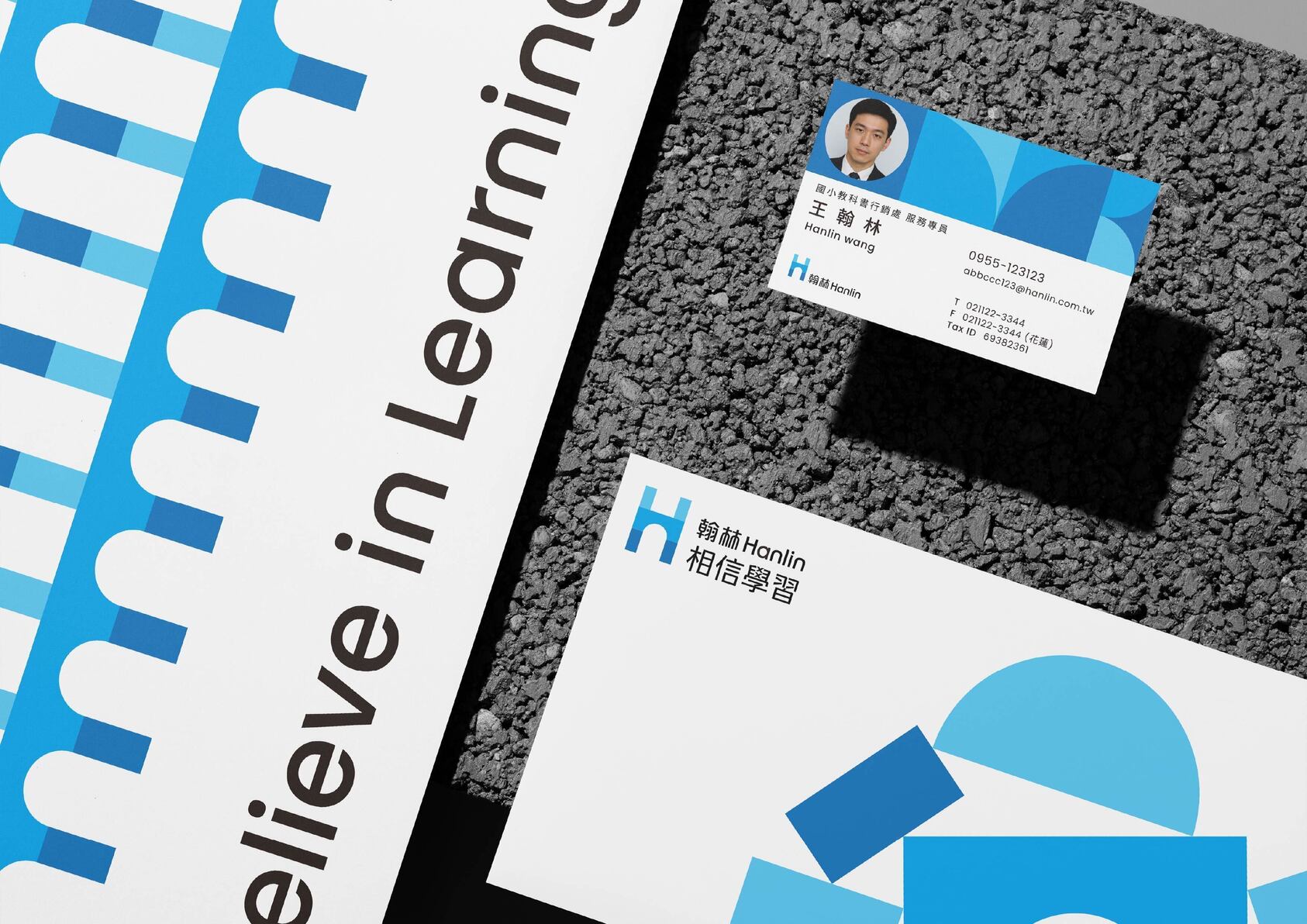
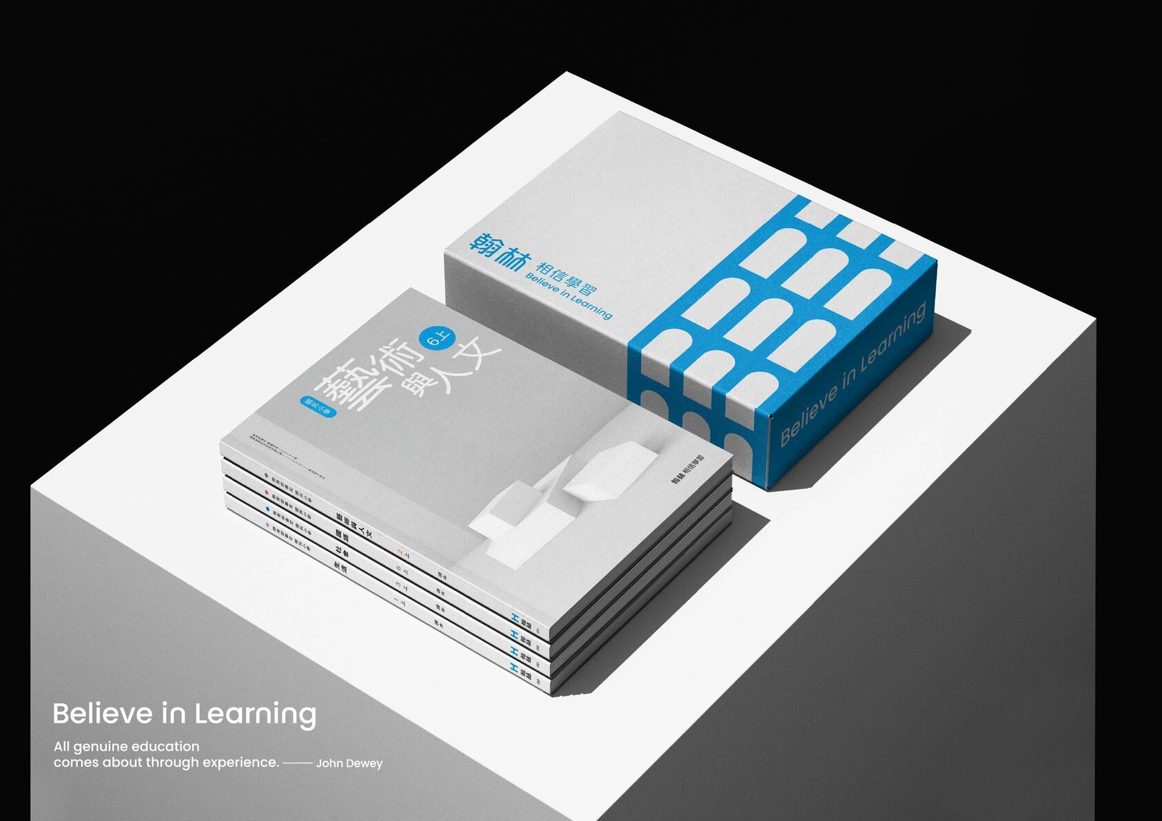
We see learning as stacking blocks to build a tower of knowledge. The logo features an “H” formed by stacked blocks, combined with a book spine to reflect Hanlin’s publishing roots. Its tall, slim shape suits textbook spine printing. The logotype was refined, adding book-inspired elements to echo the logo—for example, the top of “翰” resembles an open book.
Other winning works