


Lhâze
MARK WINNER
-
CategoryCommunication Design
-
SubCategoryCorporate and brand identity
-
Applicant CompanySo Creative Studio / China
-
Manufacturer / Business OwnerLhâze / China
-
Design CompanySO Creative Studio / China
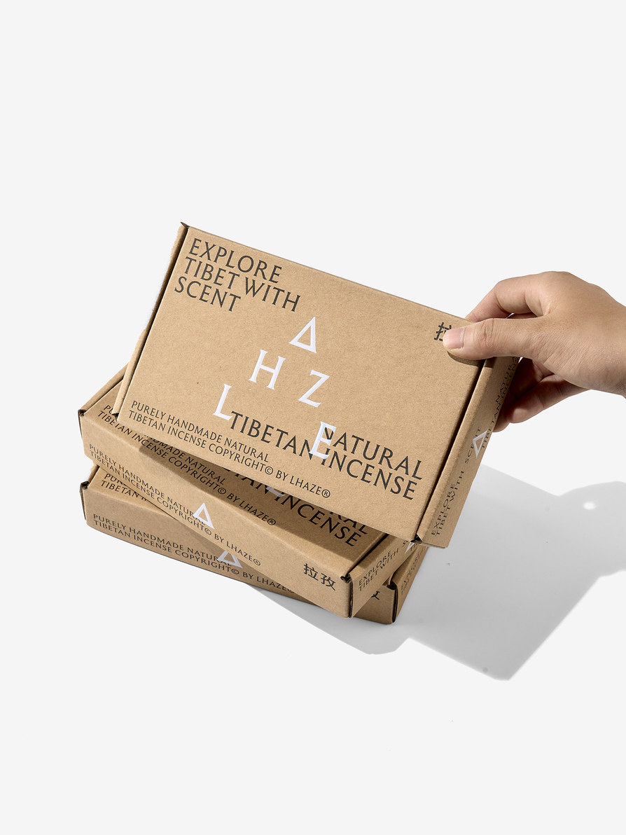
The Chinese meaning of Lhazê is "the golden top of the sacred mountain where light shines first", which is also the inspiration for this brand and packaging design.
The letter "A" was designed to have a golden mountain tip and the letter arrangement was adjusted to a layout similar to it as well in order to enhance the name itself. On top of it, triangular packaging with different colours and an unified golden top decoration is used to match each fragrant accordingly to bring out the character.


