2025 Taiwan Design Expo (((CHANGHUA)))|Visual Identity
MARK WINNER
-
CategoryCommunication Design
-
SubCategoryBrand Identity
-
Applicant CompanyAaron Nieh Workshop / Taiwan
-
Manufacturer / Business OwnerChanghua County Government、Taiwan Design Research Institute / Taiwan
-
Design CompanyAaron Nieh Workshop / Taiwan
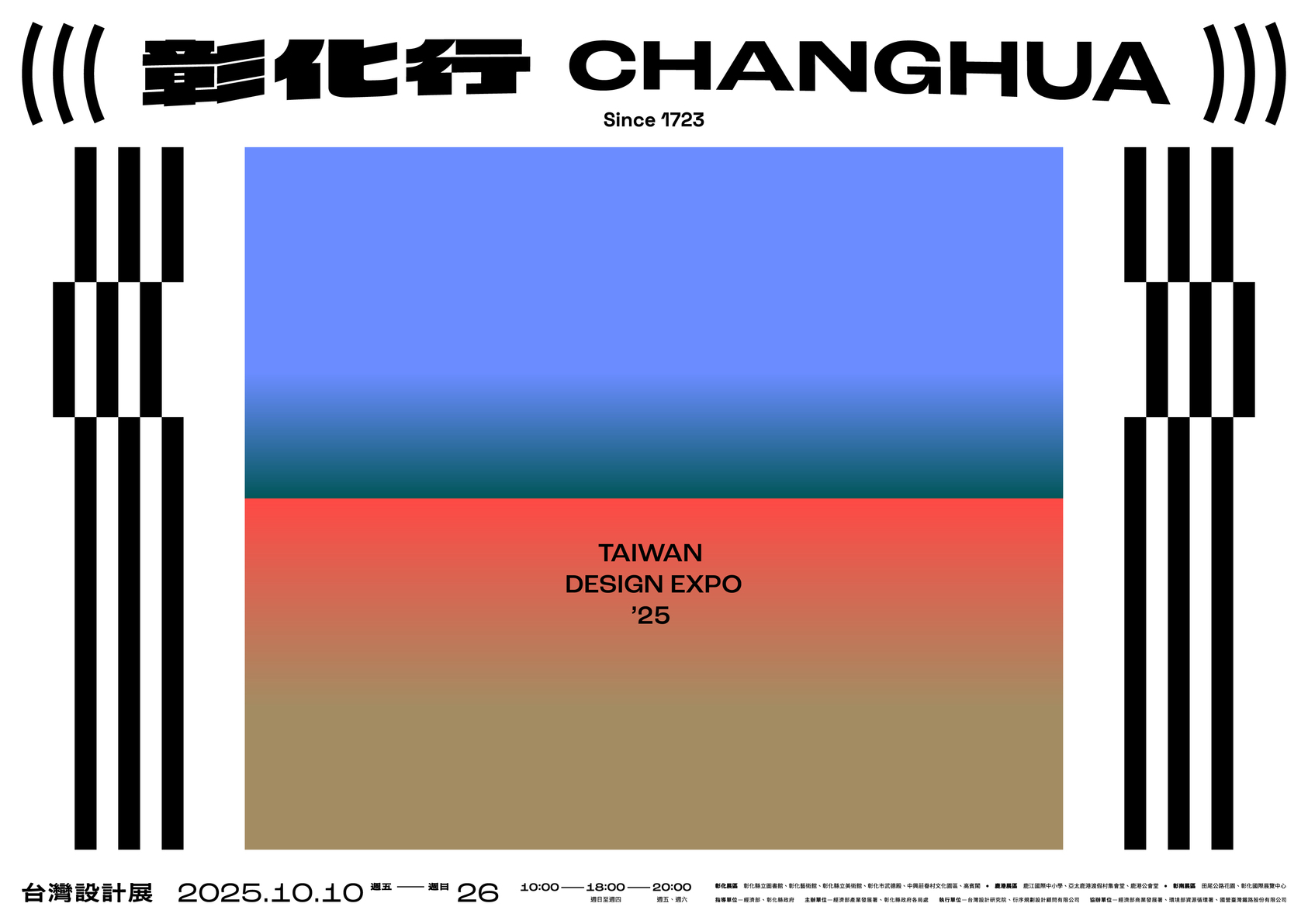
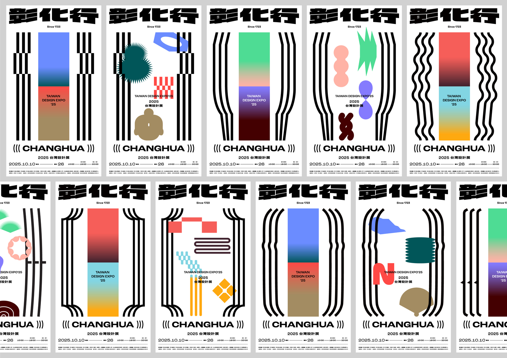
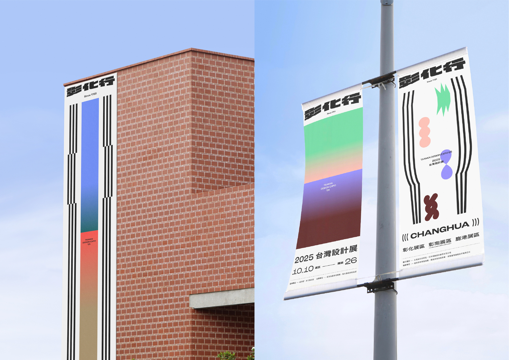
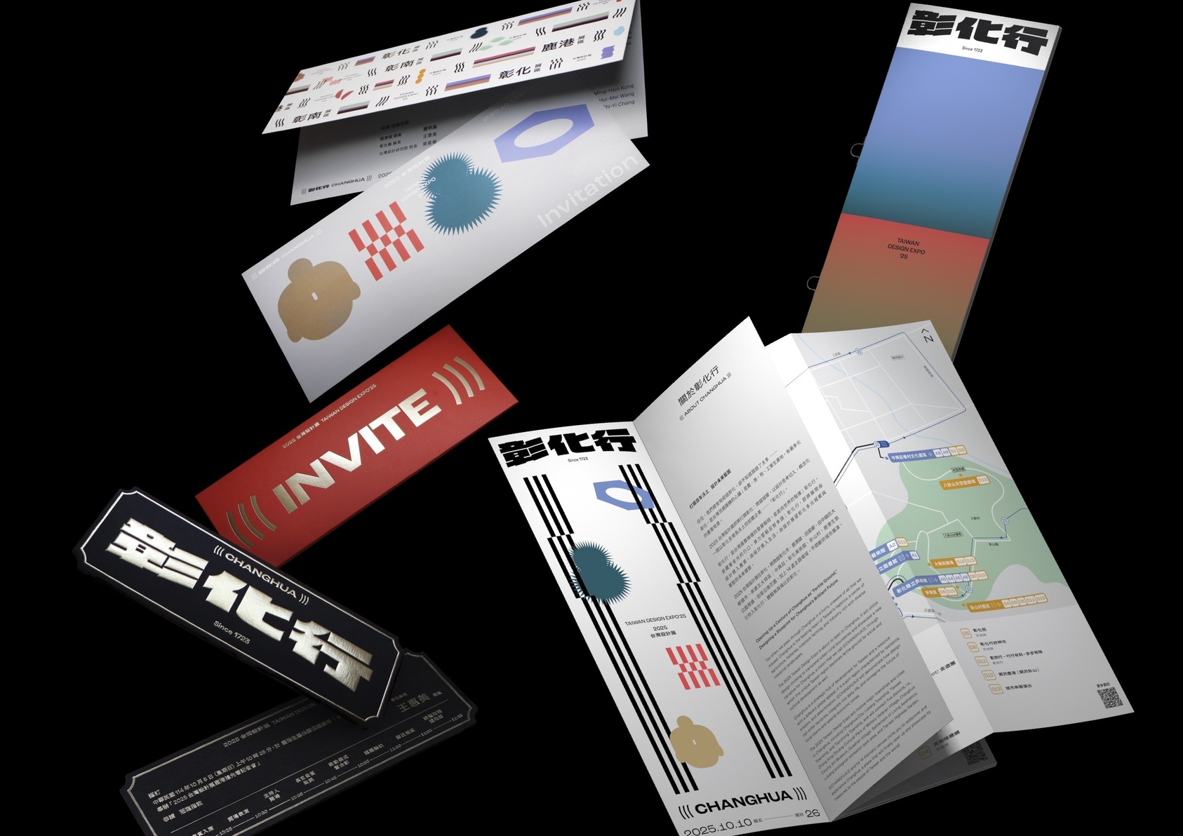
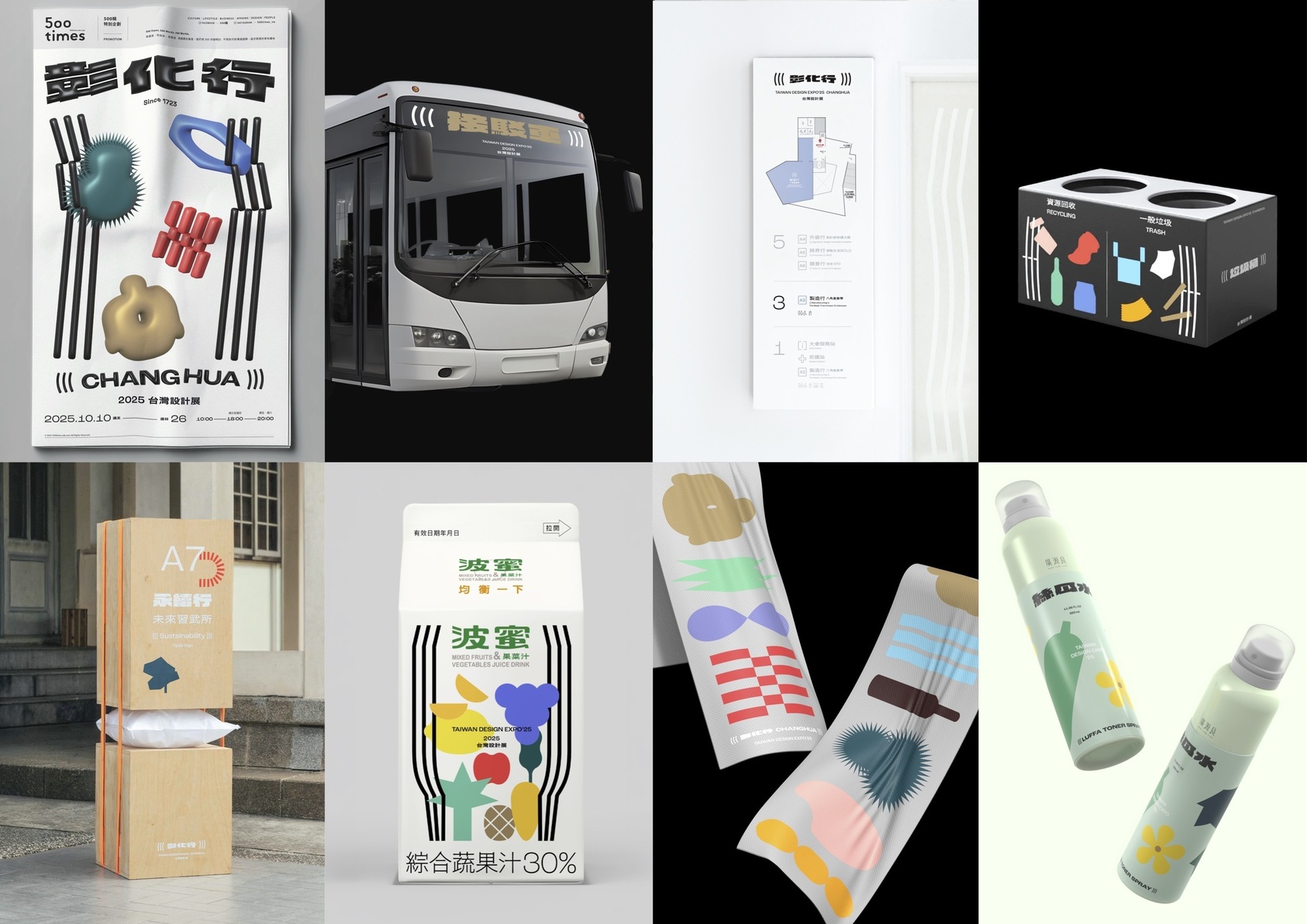
Visual identity for the 2025 Taiwan Design Expo, themed "Changhua Háng (((CHANGHUA)))." It translates the character "行" into the symbol "((( )))" as a structural backbone for info hierarchy and visual nodes. This ensures high recognizability and efficient dissemination across diverse media. Combined with local colors and geometric imagery, it forms a cohesive system carrying regional culture and collective memory.