
FUJIYA
-
CategoryCommunication Design
-
SubCategoryCorporate and brand identity
-
Applicant Company6D-K CO., LTD. / Japan
-
Manufacturer / Business OwnerFujiya Co.,Ltd / Japan
-
Design Company6D / Japan
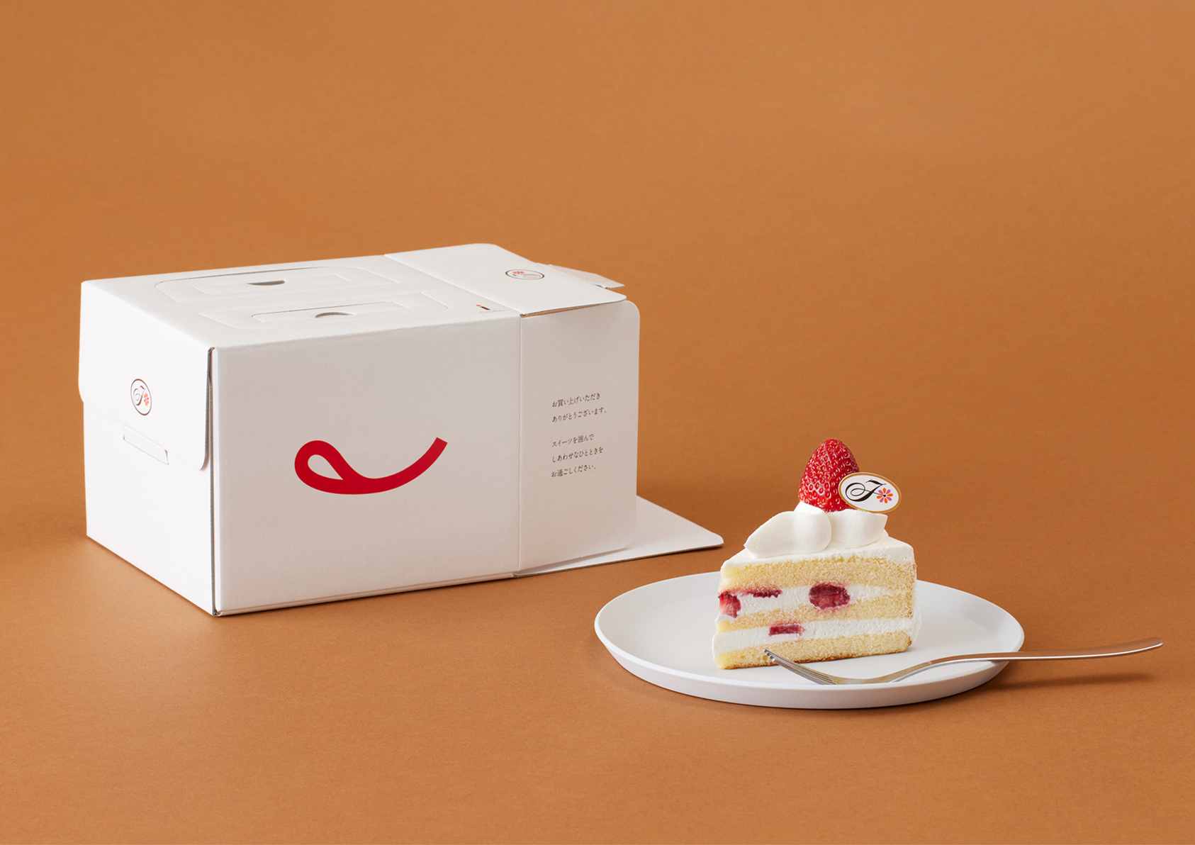
We first systemized the fragmented identities—the "F" mark, logotypes, and character. Focusing on the tongue-out smile of "Peko-chan", we extracted and symbolized her iconic mouth as the new logo. It was positioned as the core identity, complemented by the "F" mark. Logotypes were unified in serif type to express friendliness and quality. The brand colors were restructured to white (color of cream) and red (the tongue), resembling a strawberry shortcake.
Jury's Evaluation
Through a refined and thoughtful approach, this redesign revitalizes a classic brand identity. By distilling the signature character into a single, powerful symbol, it achieves maximum recognition with minimal elements. The result strikes an exceptional balance between nostalgia and modernity, standing out as an exemplary case of brand renewal.