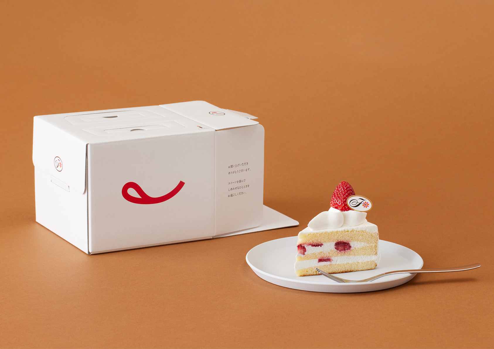

FUJIYA
金點設計獎標章、年度最佳設計獎
-
參賽類別傳達設計類
-
參賽組別企業/品牌識別
-
申請公司6D-K CO., LTD. / 日本
-
客戶/業主Fujiya Co.,Ltd / 日本
-
設計公司6D / 日本
We first systemized the fragmented identities—the "F" mark, logotypes, and character. Focusing on the tongue-out smile of "Peko-chan", we extracted and symbolized her iconic mouth as the new logo. It was positioned as the core identity, complemented by the "F" mark. Logotypes were unified in serif type to express friendliness and quality. The brand colors were restructured to white (color of cream) and red (the tongue), resembling a strawberry shortcake.
評審評語
以精煉手法重塑經典品牌識別,從招牌角色提取核心符號,用最少的元素,達成最強的辨識度,亦在懷舊與當代之間取得絕佳平衡,堪稱品牌再造的經典案例。