Harmophy Brand Design
MARK WINNER
-
CategoryCommunication Design
-
SubCategoryCorporate and brand identity
-
Applicant CompanyZERO DESIGN / Taiwan
-
Manufacturer / Business OwnerNoah Humanities and Arts CO. / Taiwan
-
Design CompanyZERO BRANDING DESIGN LTD. / Taiwan
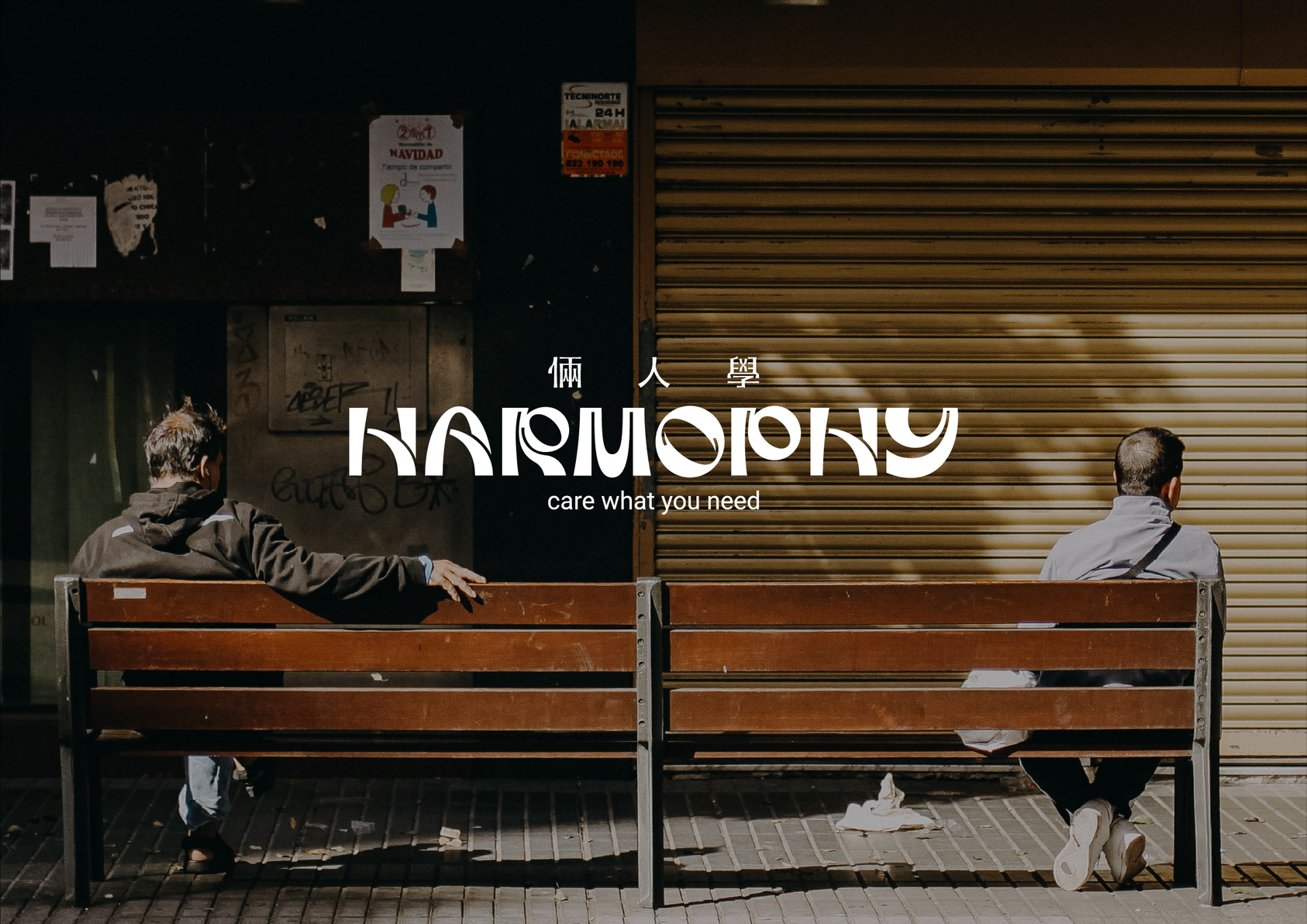
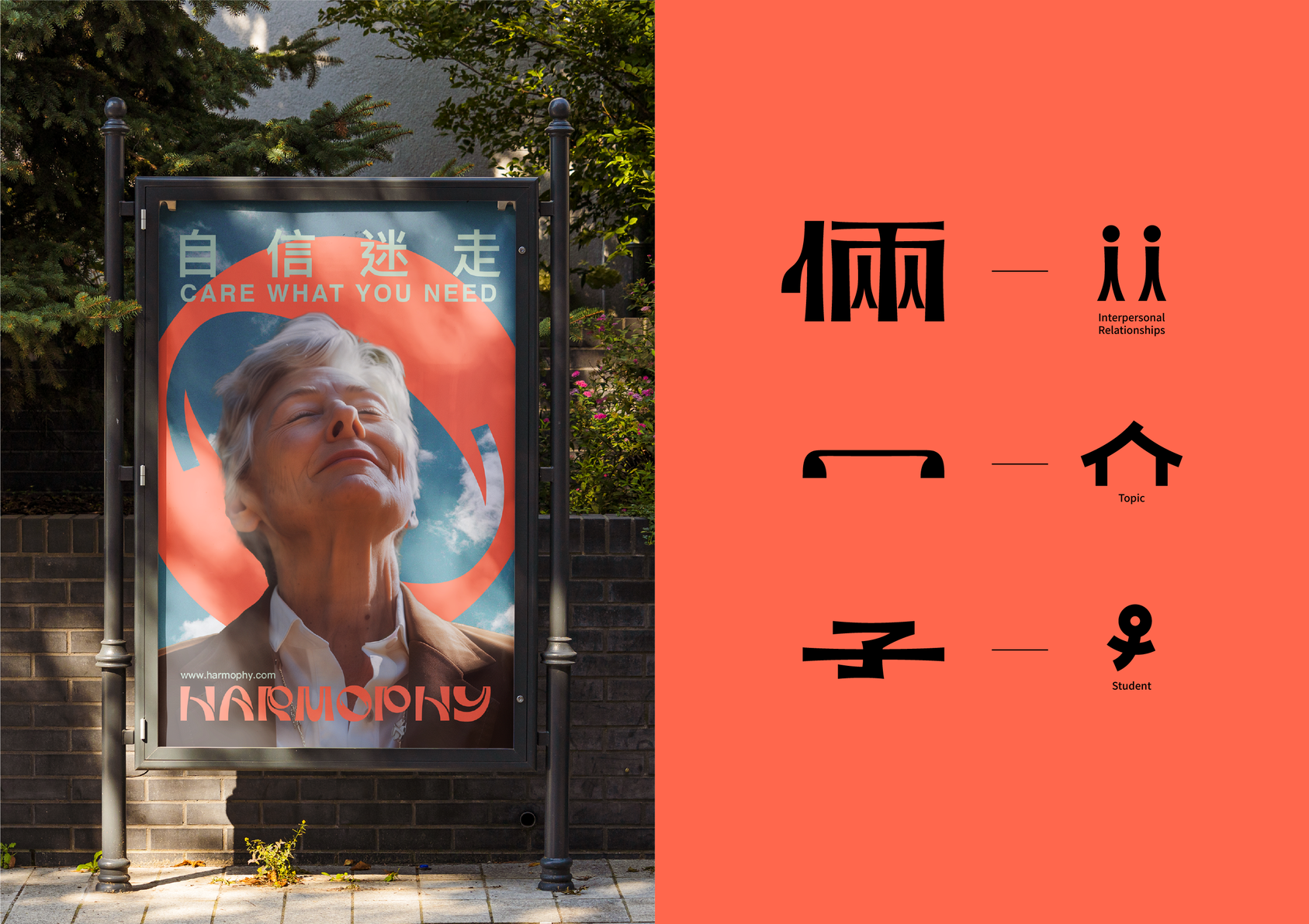
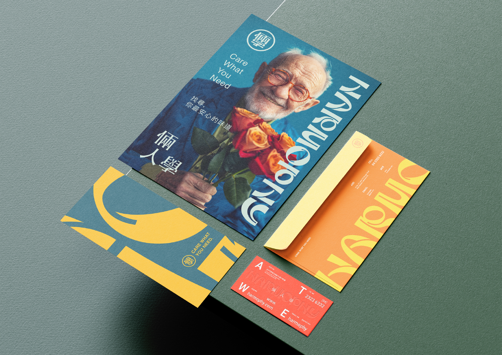
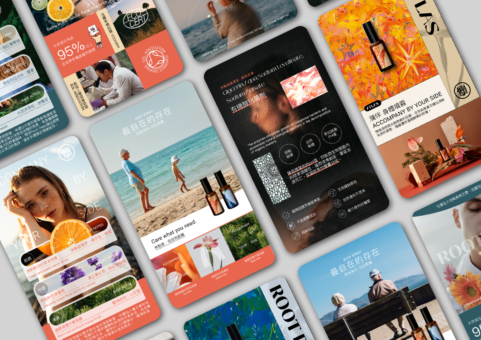
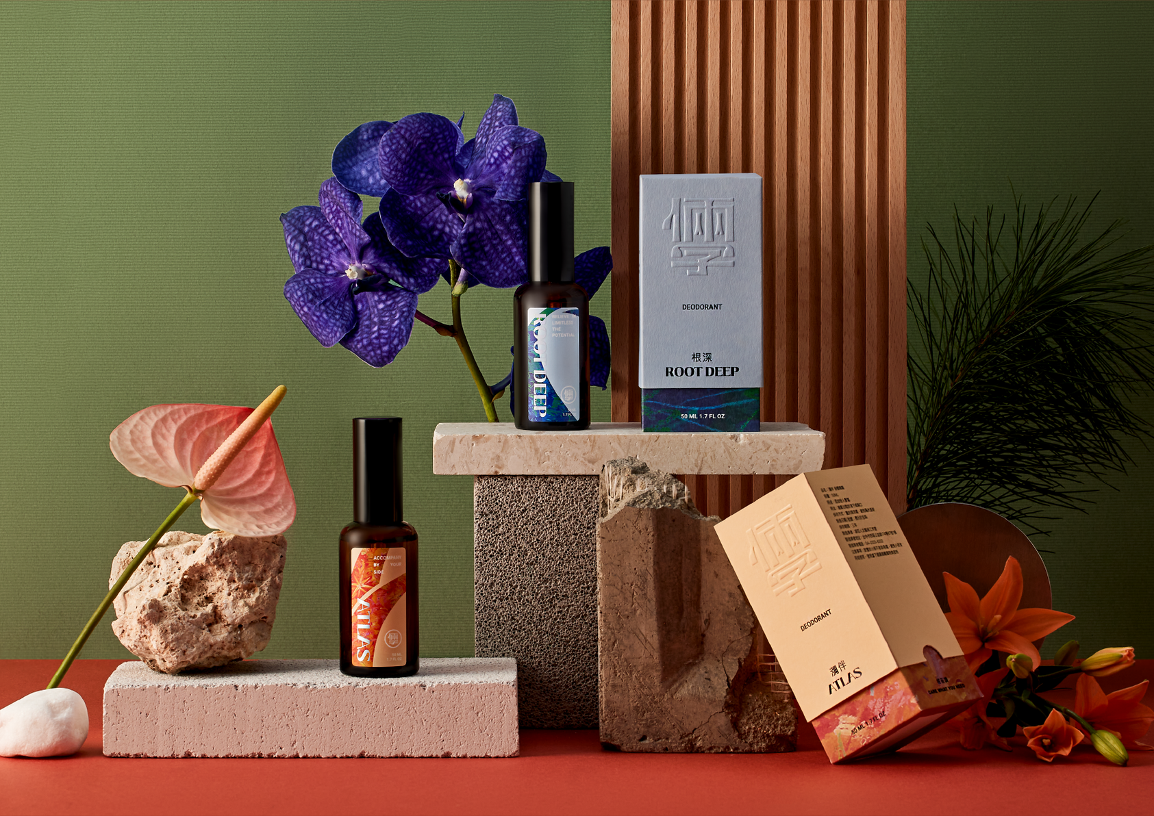
The logo design ingeniously extracts the character "人" (person) from the Chinese word "倆人" (couple), interpreting the core of the brand: bringing people closer together and accompanying growth. Extracting the strokes of "冖" (classroom) and "子" (student) from the Chinese character "學" (learn) signifies the continuous process of learning and growth in interpersonal relationships. This human-centric spirit also creates a friendly, inclusive, and empathetic brand atmosphere.
Other winning works