BORRN
MARK WINNER
-
CategoryCommunication Design
-
SubCategoryB-01 Corporate and brand identity
-
Applicant CompanyKimhung Design / Hong Kong
-
Manufacturer / Business OwnerBORRN (U.K.) Ltd.
-
Design CompanyKimhung Design / Hong Kong
-
DesignerKimhung Choi , Jolie Wong & Suze Chan
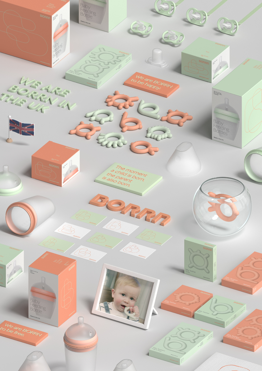
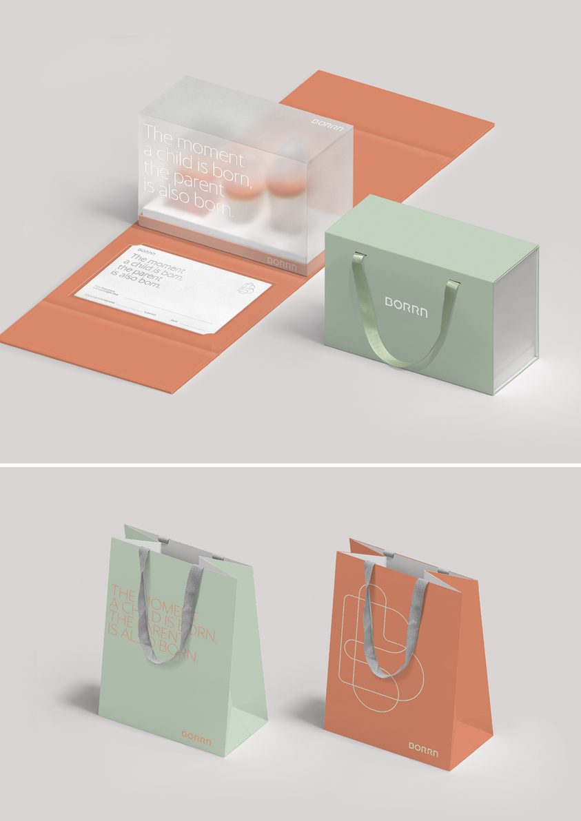
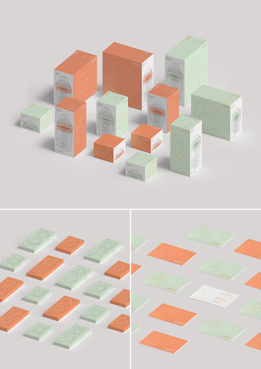
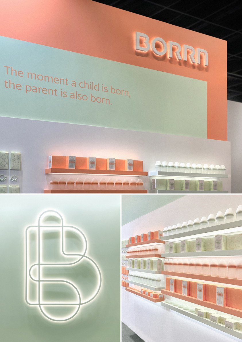
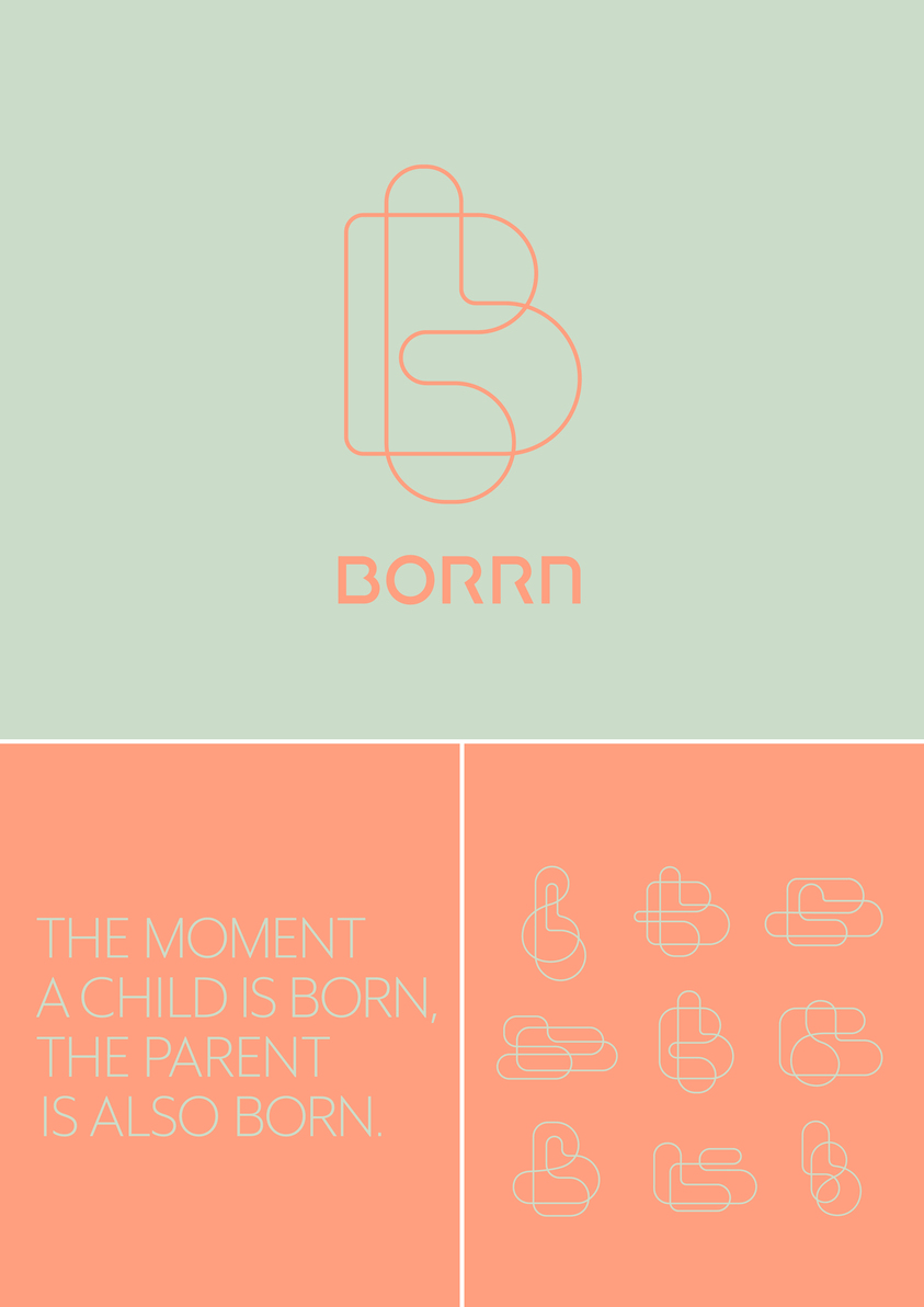
The corporate identity design of BORRN consists of a logotype, a set of dynamic logo marks and a gender neutral color scheme.
BORRN’s logo is a visualisation of “B” and “b” in organic forms drawn with one continuous line, symbolising the connection between Parent and Child, and storylines of families. BORRN logo is dynamic and fluid, illustrating possibilities and uniqueness of every family.