

Hanhuang Group Rebranding
-
CategoryCommunication Design
-
SubCategoryCorporate and brand identity
-
Applicant Companythink brand consultancy / Taiwan
-
Manufacturer / Business OwnerHanhuang Group / Taiwan
-
Design Companythink brand consultancy / Taiwan
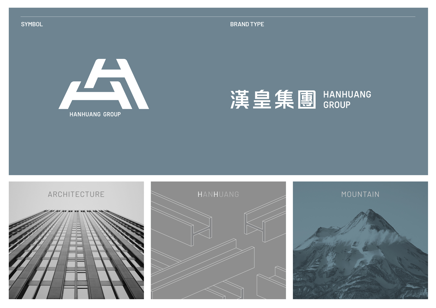
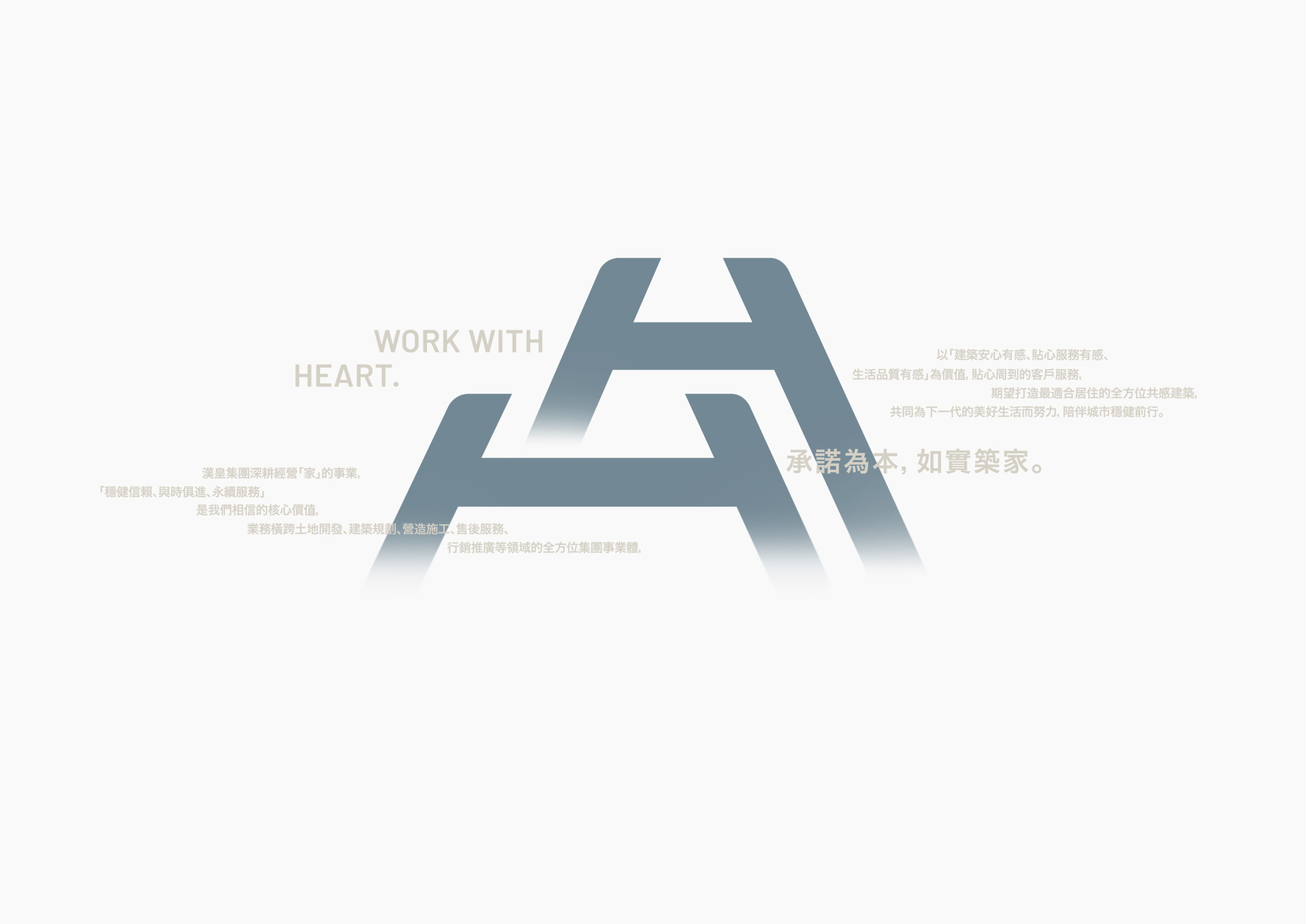
With the company’s second-generation leaders generating new visions for the future, they hope that Hanhuang can revamp its brand identity as a local builder and restart with a new image to become an international company. The new brand identity is embodied in the logo design. Through planning, we focus on its original intention of building houses with corporate conscience. The logo design utilizes the two H’s in Hanhuang.
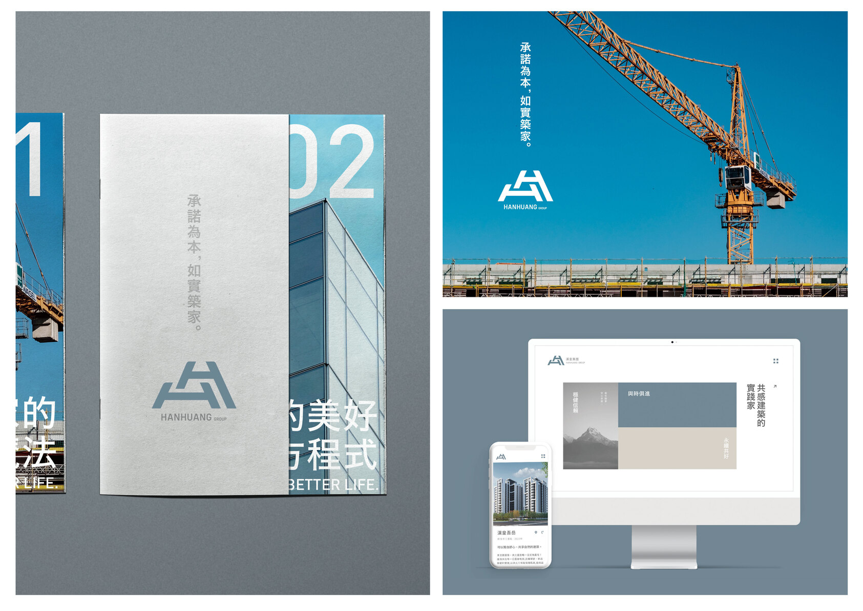
This design echoes the steel frame elements at the foundation of Hanhuang’s business and is combined with the perspective characteristics of building architecture. The mountain-like image is evident and magnificent and symbolizes the unwavering relationship between Hanhuang and all customers. In terms of color applications, gray blue is set as the brand’s main color, and white, gray, and black are used as additional colors to interpret the brand’s professionalism. It compares the brand to the undivided focus of Japanese artisans and evokes a stable and practical brand tone.The patterns are extended and integrate the idea of clouds and fog in the mountains. It presents a brand image that combines humanistic qualities and devotion to a sustainable environment.


