Hey, kids !
-
CategoryCommunication Design
-
SubCategoryCorporate and brand identity
-
Applicant CompanySAYSOOO / China
-
Manufacturer / Business OwnerHeyBetter / China
-
Design CompanySAYSOOO / China
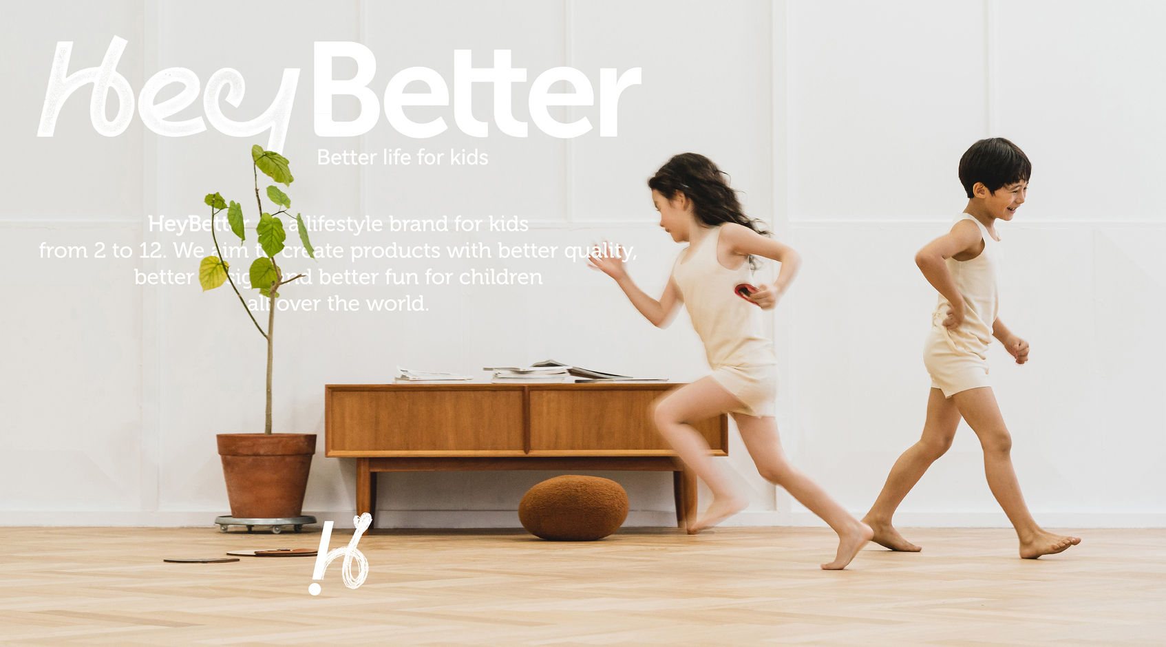
When working with maternal-and-infant brands, we often think whether the user's feelings should be more respectful of child as the actual user or parents as the buyer, and how to balance the demands of them and convey it to the consumers? The population aged 1-12 and their parents are a very board and aesthetically diverse group, how to create an eye-catching and universal, minimalist and powerful application for a brand from 0-1 to make it easy for adults and children alike to remember a unique brand symbol and to translate the brand's value proposition appropriately, it is challenging - Better life for kids.
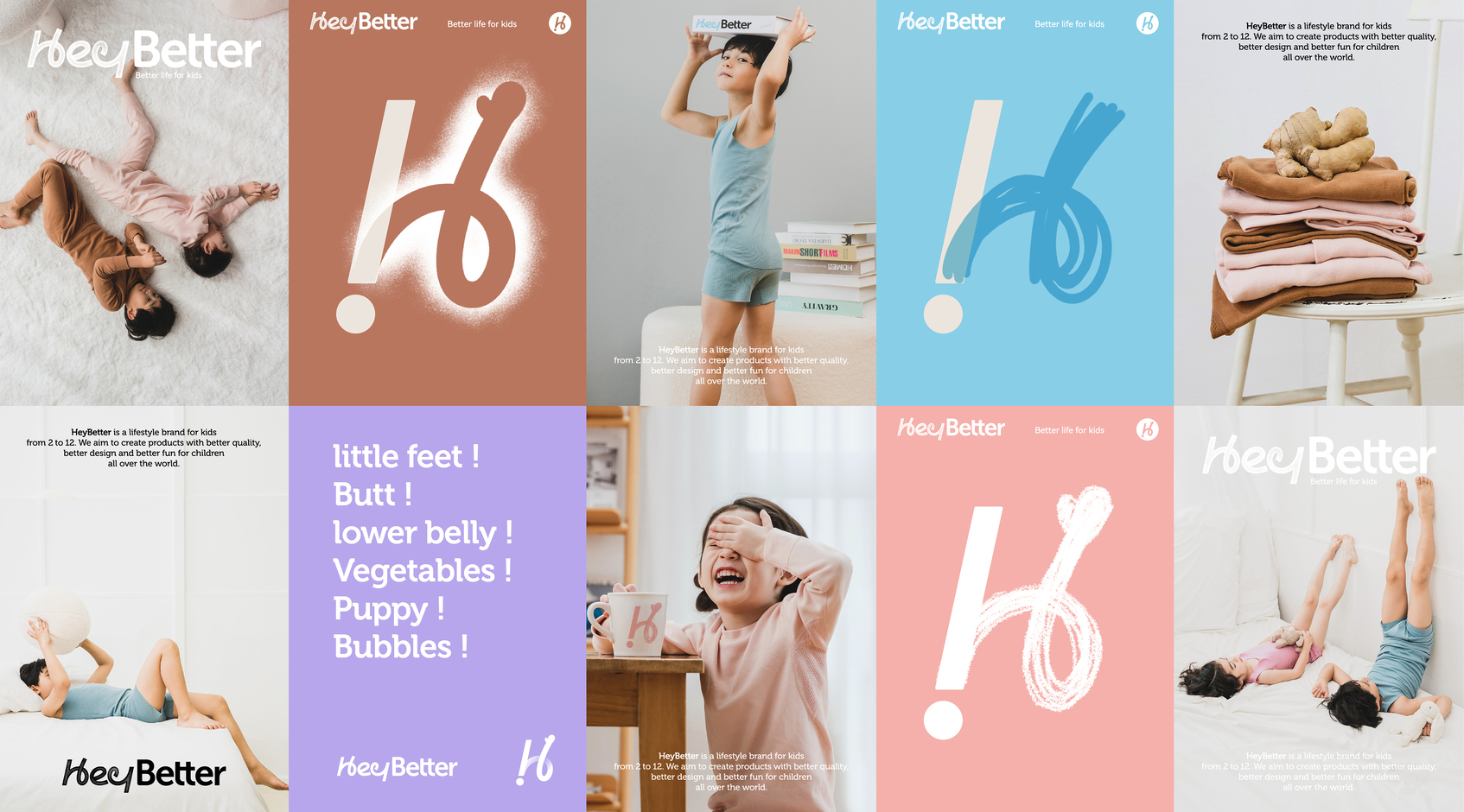
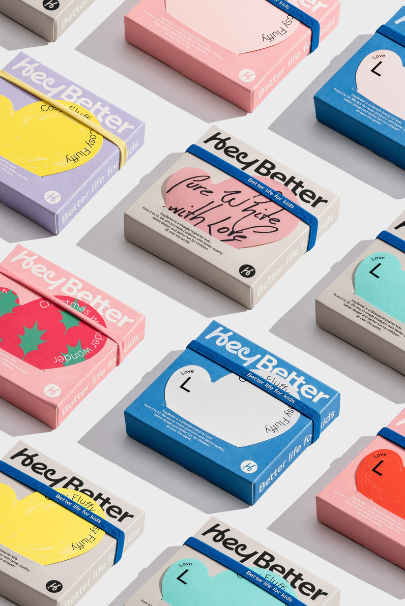
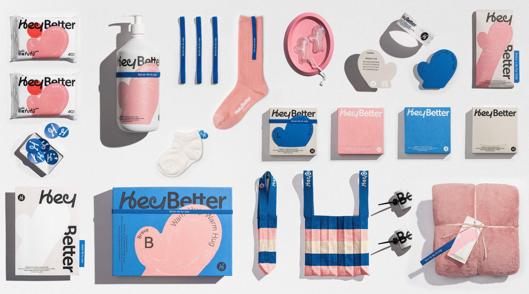
The initial H, the exclamation mark representing curiosity and the small hand greeting reinforce the unique symbolic memory of the main logo. The brand font, Hey, is made with continuous pen and handwriting sense, Better is easy to recognize and stable, just like the brand conveys: to be fun, to be safe.
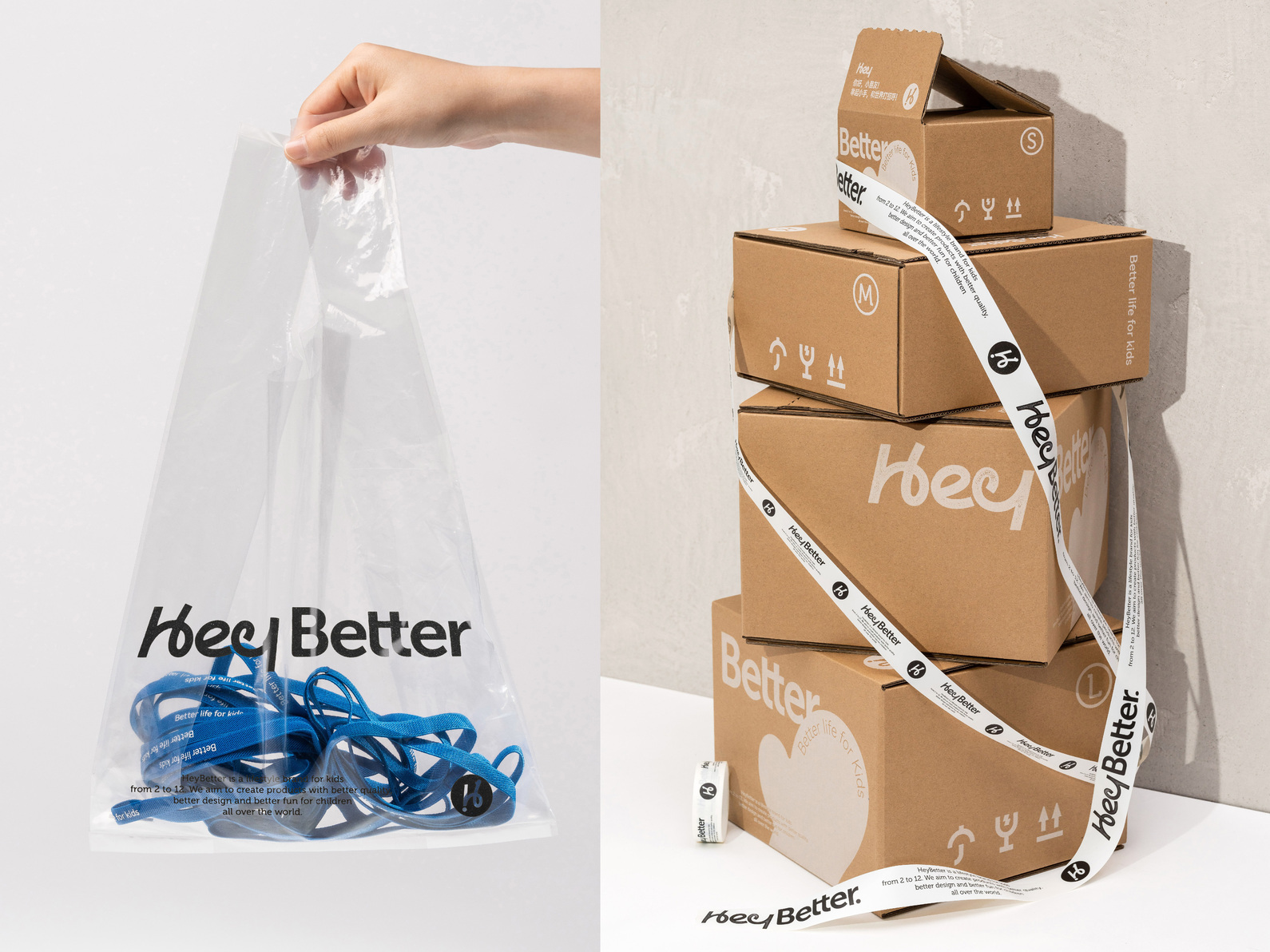
As a new brand online for 3 months, it has achieved monthly sales of more than 10 million, and the cumulative sales of star products have exceeded 2,000,000 so far, using every aspect of the brand output to build emotional resonance with users. The unique mark "H" and small hand elements are not only the brand image, but also extend to product development, has been deeply remembered by users. There are also a variety of interactive ways to focus on user experience in the package making, such as boxes can be recycled into handicrafts to promote parent-child interaction.