


Child Welfare League Foundation Brand Identity Visual Design
-
CategoryCommunication Design
-
SubCategoryCorporate and brand identity
-
Applicant CompanyPHALANX CREATIVE & DESIGN CO., LTD. / Taiwan
-
Manufacturer / Business OwnerChild Welfare League Foundation / Taiwan
-
Design CompanyPHALANX CREATIVE & DESIGN CO., LTD. / Taiwan
Since the revision of the Child and Youth Welfare Act in 1991, the CWLF has went thorough thirty years of development, providing over 25 service programs. Evolving with the times, its scope has expanded to encompass various aspects, extending beyond vulnerable care to include social research, value advocacy, and other progressive initiatives.
However, the public's perception of public interest foundations largely remains limited to fundraising. This project aims to optimize visual design to present and highlight the brand's voice for children, assisting in enhancing the positive impact on children's quality of life.
With the widespread use of smartphones and communication software, communication has become more instant and convenient. Emoji symbols are a product of the technological era. They not only replace textual messages but also add warmth and fun elements and creating a sense of friendliness, particularly among young children and youth.
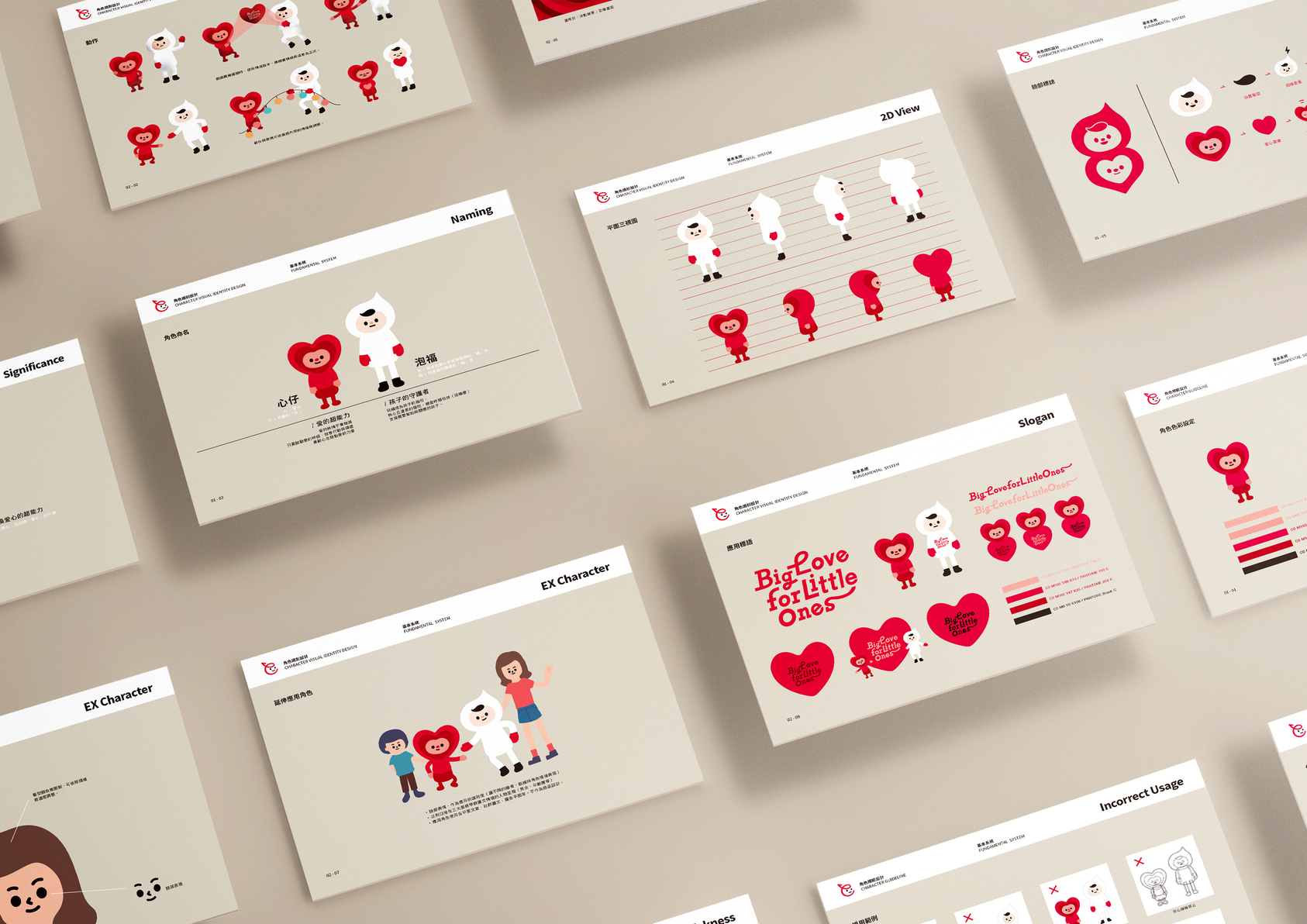
When contemplating a brand design targeting children, our goal is to retain the simplicity and approachability of emojis. Thus, the core concept of the CWLF's brand identity symbol was born, embodying a more effective and faster symbol of the new generation and the brand communication.
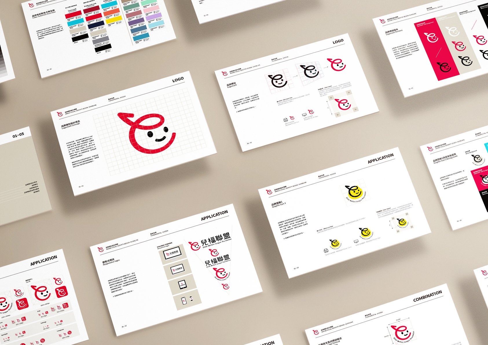
Inspired by emojis, the logo design concept combines the initial letter "C" representing Children with a playful smiling face, a circular head outlined in a single stroke, and an upward-pointing arrow.
Through simplified logo design, the CWLF aims to enhance memorability and facilitate effective communication of its future outlook and service attributes. Simultaneously, it seeks to construct a sense of modern identity for children and youth organizations in the public's perception, thereby discovering the new era values advocated by the CWLF.


