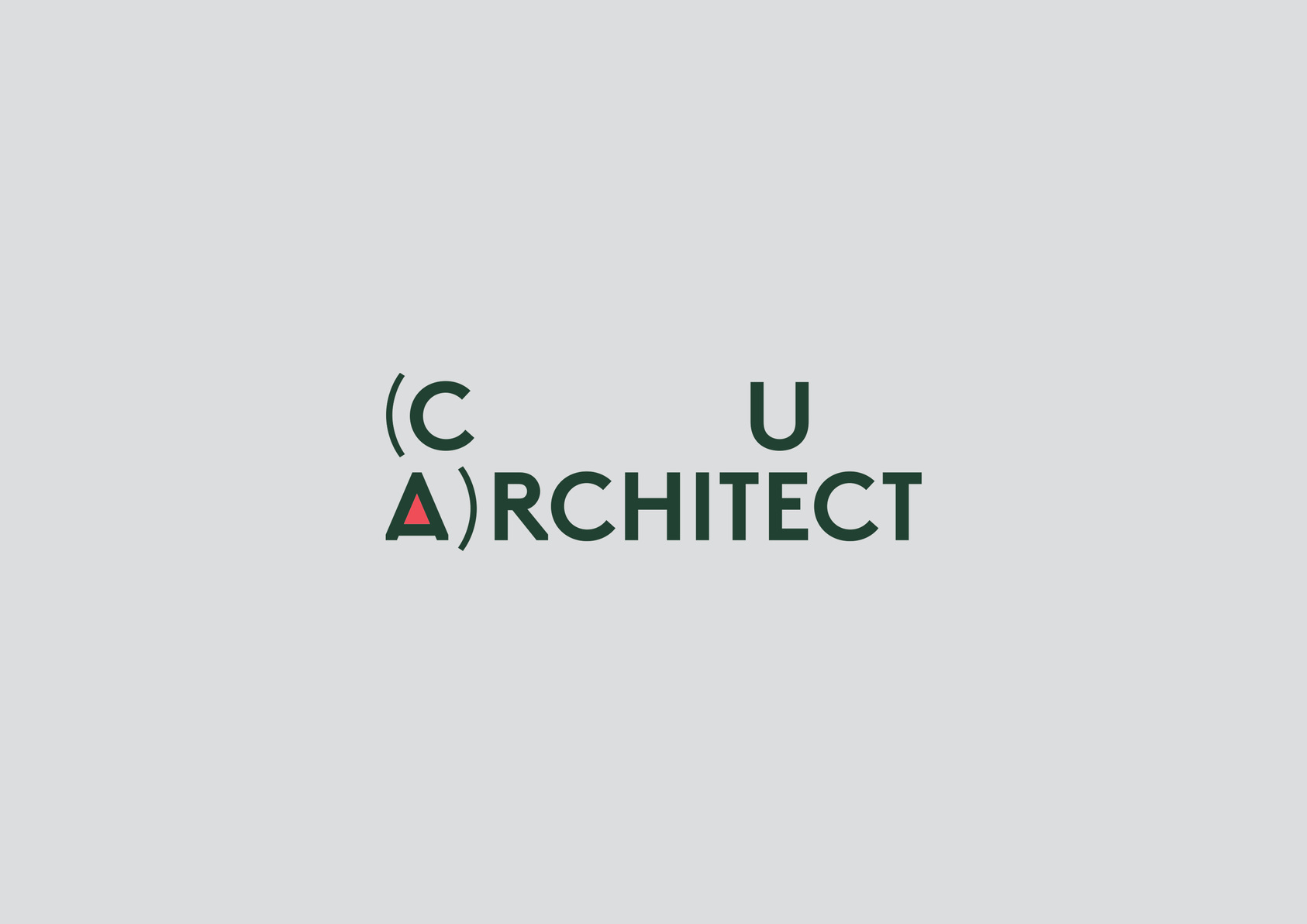
“(CUA)rchitect” Exhibition Visual Identity
MARK WINNER
-
CategoryCommunication Design
-
SubCategoryCorporate and brand identity
-
Applicant CompanyKimhung Design / Hong Kong
-
Manufacturer / Business OwnerThe Chinese University Architecture Alumni Association / Hong Kong
-
Design CompanyKimhung Design / Hong Kong
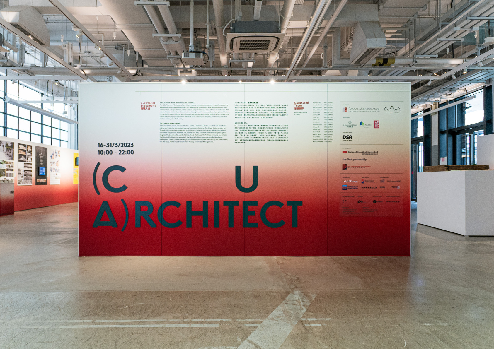
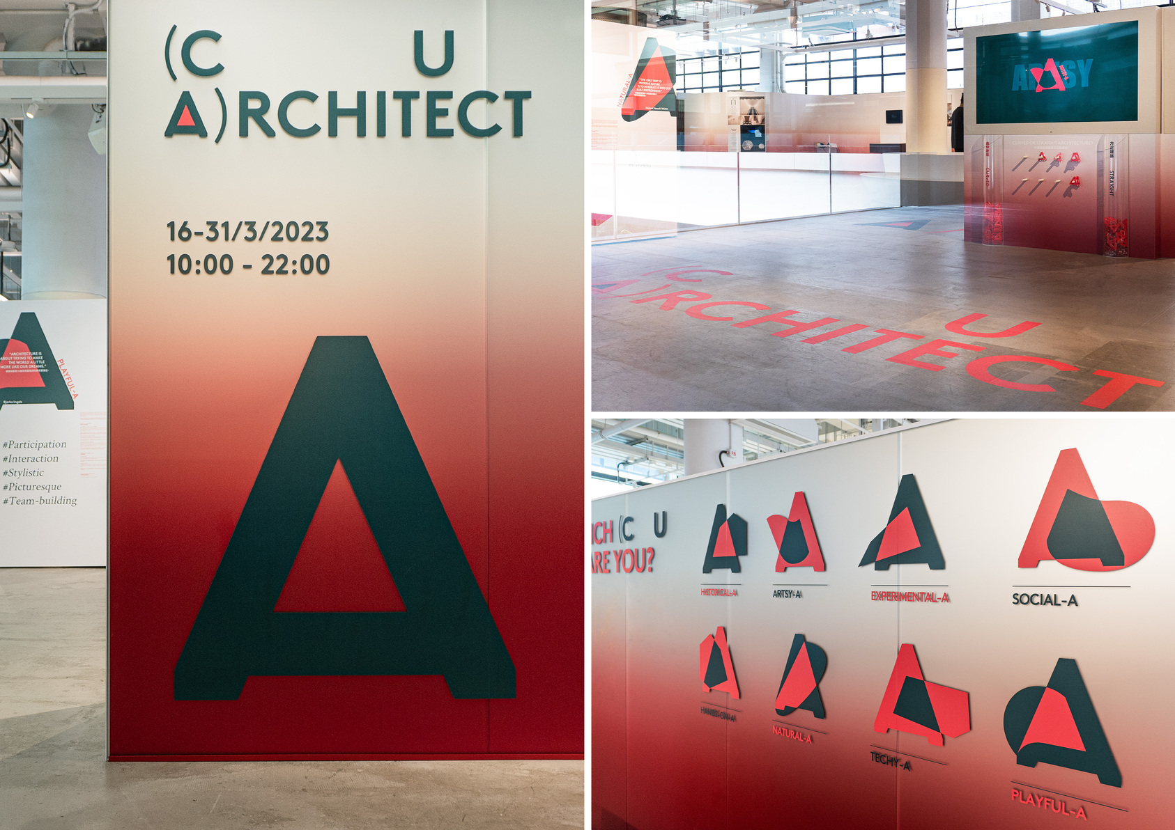
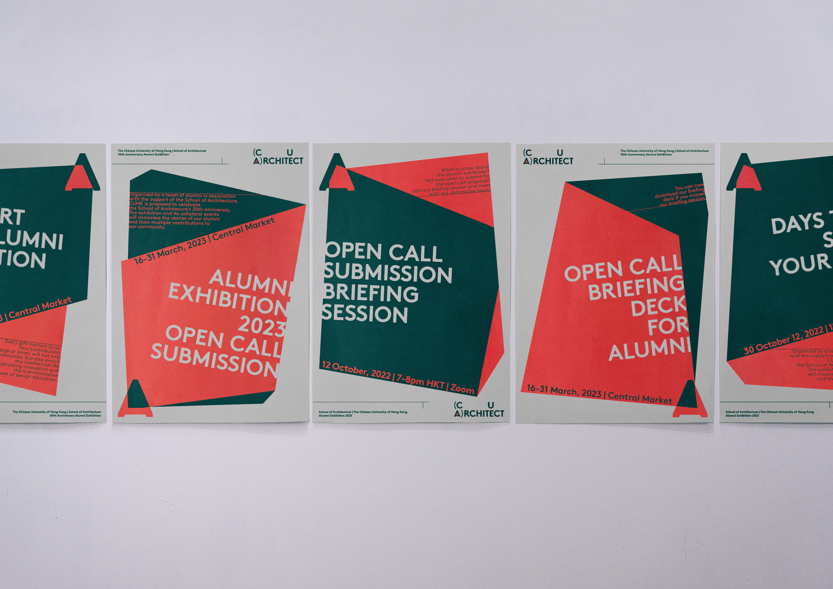
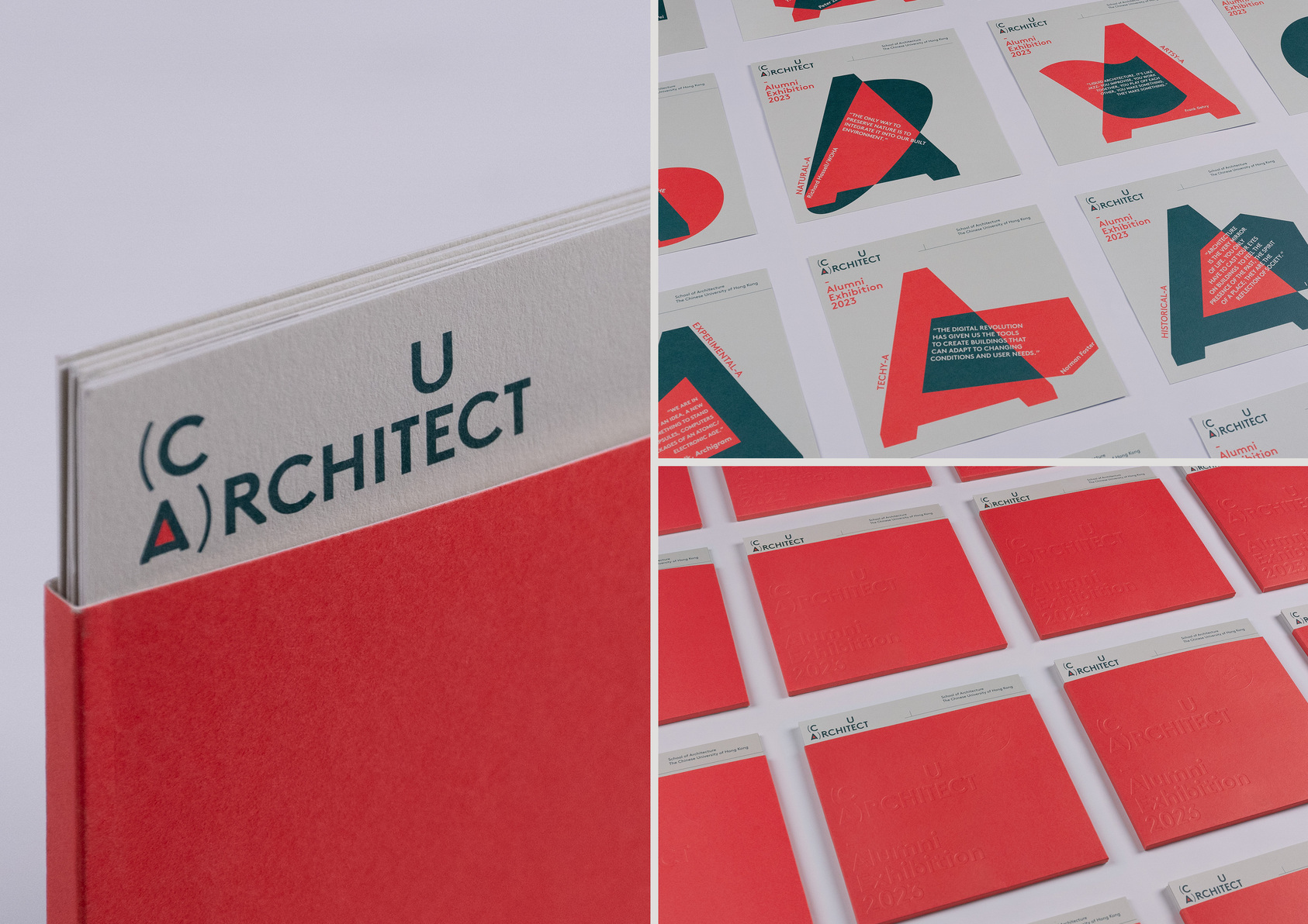
“(CUA)rchitect” Exhibition s key visual design features dynamic forms of the letter “A” symbolising both architect and alumni to represent the multifaceted nature of architecture. The typography reflects a bold and modern style, showcasing the forward-thinking approach of the Exhibition that offers visitors a brand-new perspective on the range of interests and specialisation a professional architect can develop after graduation.
Other winning works