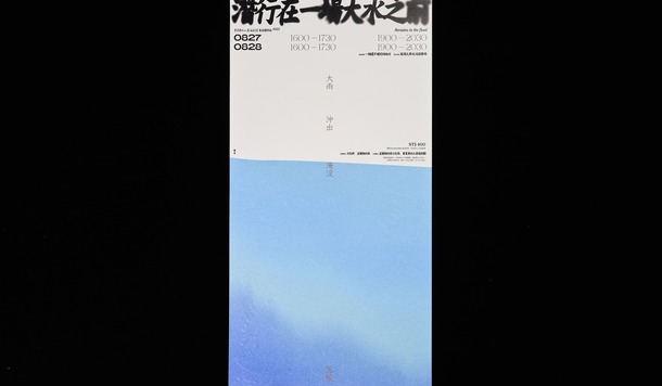
 2026 Golden Pin Design Awards: Global Call for Entries Now Open!
Golden Pin Design Award | Golden Pin Concept Design Award
2026-03-11
2026 Golden Pin Design Awards: Global Call for Entries Now Open!
Golden Pin Design Award | Golden Pin Concept Design Award
2026-03-11
2026 Golden Pin Design Awards: Global Call for Entries Now Open!
Golden Pin Design Award | Golden Pin Concept Design Award
2026-03-11
2026 Golden Pin Design Awards: Global Call for Entries Now Open!
Golden Pin Design Award | Golden Pin Concept Design Award
2026-03-11
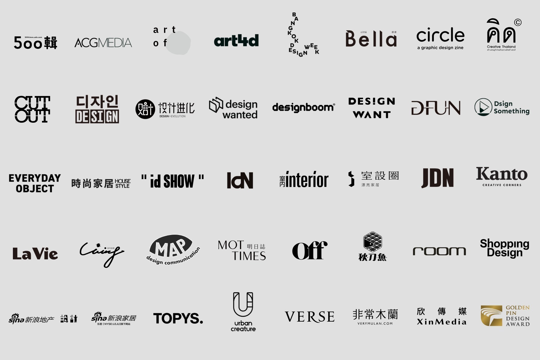 The 2025 Golden Pin Design Award Expands Its Global Media Network, Partnering with 39 Leading Media Platforms Worldwide
Golden Pin Design Award
2025-12-30
The 2025 Golden Pin Design Award Expands Its Global Media Network, Partnering with 39 Leading Media Platforms Worldwide
Golden Pin Design Award
2025-12-30
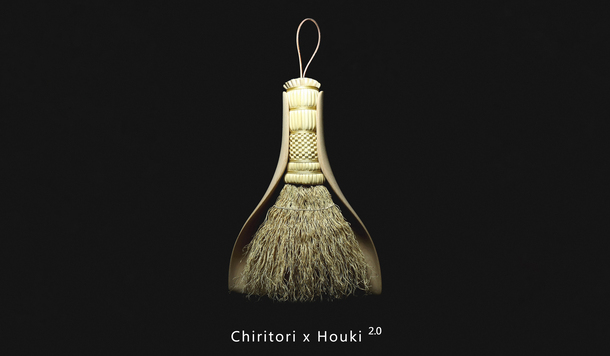
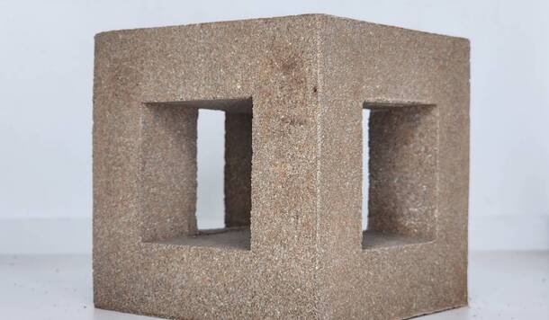
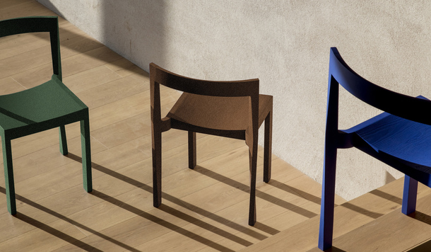
 2025 Golden Pin Design Awards Ceremony Unveils Best Design and Special Award Winners
Golden Pin Design Award | Golden Pin Concept Design Award
2025-12-05
2025 Golden Pin Design Awards Ceremony Unveils Best Design and Special Award Winners
Golden Pin Design Award | Golden Pin Concept Design Award
2025-12-05